Baskerville type specimen
A Timeless Typeface
Project BrieF
A project exploring the historical and typographic history of the Baskerville typeface, designed by John Baskerville in 1754.
DELIVERABLES
15x20” Poster, 5.75x6.5” Booklet, Motion Graphic
Portrait of John Baskerville / National Portrait Gallery / Public domain
RESEARCH
Part of responsibly designing a type specimen is understanding the historical context which it was designed in.
Historical research is MY JAM. Prior to pursuing design, I planned on becoming a U.S. History Professor. That's a story for another day.Before putting any pencils to paper or shapes to pages, I did a deep-dive into the life of Mr. John Baskerville. As it turns out, he was a pretty killer dude! A few interesting bits about him—
John was a self-taught type-founder and printer born in Birmingham, Alabama. Despite being a printer by trade, he was illiterate. He saw type as abstract forms. This would govern his pursuit of the “perfectly balanced letterform”.
His typeface became extremely controversial, with Benjamin Franklin penning a letter to defend John’s typeface against critics who called it “hurtful to the eyes”.
'INK”
“WEATHER”
“AGE”
INSPIRED COLORS
I wanted the color palette to feel of the time, even if it wasn’t necessarily representitive of the time. This lead to three core colors: Ink, Weather, and Age.
Ink is a deep scarlet meant to call back to the British heritage of John Baskerville. It also reminded me of a rusted metal tone, thinking about the iron construction of historical printing presses.
Weather is a medium brown inspired by the stains found on old documents caused by dust and dirt. The relics left behind by dirty tools and fingertips.
Age is a cream deriving from he way old papers tend to shift yellow as they’re exposed to sunlight. If we saw a document that John printed today, I’m certain there wouldn’t have fluorescents keeping it white.
Process sketches for rough poster layouts
Final Poster Design
Poster design
After exploring layouts of varying degrees of expressiveness, I landed on a tame, gridded layout that gives each bit of information it’s breathing room.
This layout is a nod to John’s pursuit of varying proportion. In the same way he pushed printing processes forward by letterforms with clear contrast, I wanted the heirarchy of the poster to have clear, clean contrast between elements. It has a beautiful elegance to the layout. It’s proper, mechanical, and utilitarian.
Process sketches for the booklet – inside and out
Final Booklet Design - Layflat
booklet Design
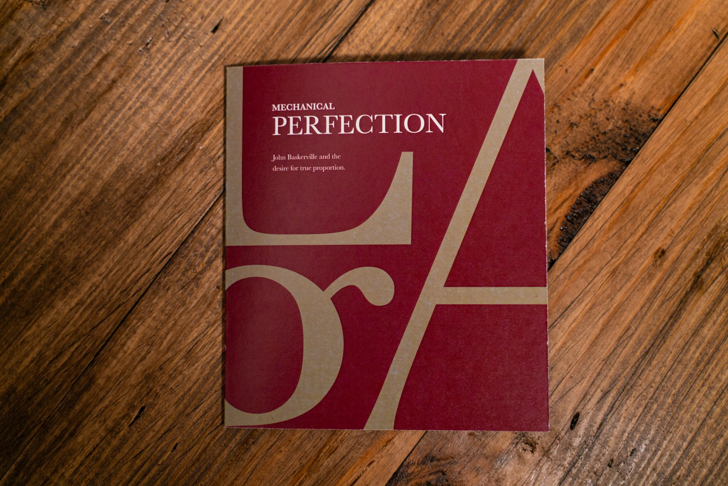
Continuing this theme of contrast, the booklet attempts to be starkly different from the poster, while still feeling like a part of the same family. To achieve this, I inverted the color scheme and made the layout dance around the page. This meant filling the page with giant letterforms that inform and balance the text placement, while accentuating the unique characteristics of each letter.
Motion Graphic Loop
A fun little extension of the Baskerville research. I used this to practice some techy After Effects things, but ended up with an expressive, and interesting loop celebrating little nuances and elements of Baskerville’s letterforms. The letters came out so cute! I hope you get mesmerized by this like I do from time to time.


